Mastering Color Theory for Stunning Embroidery Projects
Mastering Color Theory for Stunning Embroidery Projects
Color is more than decoration in embroidery—it's your voice. It guides the eye, sets the tone, and tells a silent story thread by thread. Whether you're stitching a simple floral hoop or an elaborate landscape scene, your color choices have the power to make a piece feel calm, bold, nostalgic, or completely fresh.
If you've ever looked at a finished embroidery and felt like something was "off" but couldn't explain why—it was probably a color issue. That's where color theory comes in. Learning how colors work together doesn't just help you avoid clashing combinations; it opens up endless creative potential. You begin to choose shades that feel intentional, balanced, and expressive—without second-guessing every stitch.
How Color Theory Helps You Stitch with Confidence
Good color choices don't happen by accident. They come from understanding relationships between colors and how our eyes respond to them. That's why even beginners can create professional-looking pieces simply by applying a few basic principles.
You don't need to memorize art school terms. You just need to understand a few tools that help build great color palettes—and know how to use them in your embroidery.
The Color Wheel: Your Creative Compass
At the heart of color theory is the color wheel. Think of it like a map that helps you plan your color journey. You've probably seen it before—divided into primary, secondary, and tertiary shades.
- Primary colors—red, yellow, and blue—are the source of all other colors.
- Secondary colors—green, orange, and purple—are made by mixing those primaries.
- Tertiary colors, like blue-green or red-orange, come from blending a primary with a neighboring secondary.
Knowing where colors sit on the wheel lets you start building combinations that feel intentional rather than random.
Color Schemes That Always Work
Once you understand the wheel, the magic begins. These simple schemes are building blocks for endless combinations—each with its own mood and visual effect.
Complementary Colors
These are colors directly opposite each other on the wheel—like blue and orange, or red and green. When used together, they create high contrast and bold energy. In embroidery, complementary colors can be powerful for focal points. Imagine a deep blue floral stitched with bright orange centers. The colors push against each other in a way that feels alive.
Analogous Colors
These are colors that sit side by side—like green, blue-green, and blue. They're naturally harmonious and perfect for creating soft, calming gradients. You'll often see them in botanical or nature-themed embroidery. Try a leafy wreath stitched in shades of sage, teal, and soft mint—it'll look blended, soothing, and cohesive.
Triadic Colors
Pick any three colors that form a triangle on the color wheel—like red, yellow, and blue. Triadic palettes are balanced but still full of contrast. They work well in playful designs or bold patterns, especially geometric or folk-inspired pieces. They don't compete with each other, but they all stand out.
Monochromatic Colors
This is the art of using just one color—but in many shades. From soft blush pink to deep wine, a monochromatic palette brings a sense of subtle elegance. It's often used in minimal, modern embroidery or projects where texture and stitch detail take center stage.
Real-World Application: How to Choose Colors for a Project
Theory is helpful, but picking colors in real life still takes a bit of planning. A few quick tips:
- If a thread color feels too loud, try softening it with neutrals like cream, taupe, or grey.
- Need more contrast? Add a touch of its complementary color—just a little—like a gold stitch detail on a navy blue background.
- Use both warm (reds, oranges, yellows) and cool tones (blues, purples, greens) for balance. A warm flower next to a cool leaf makes both look better.
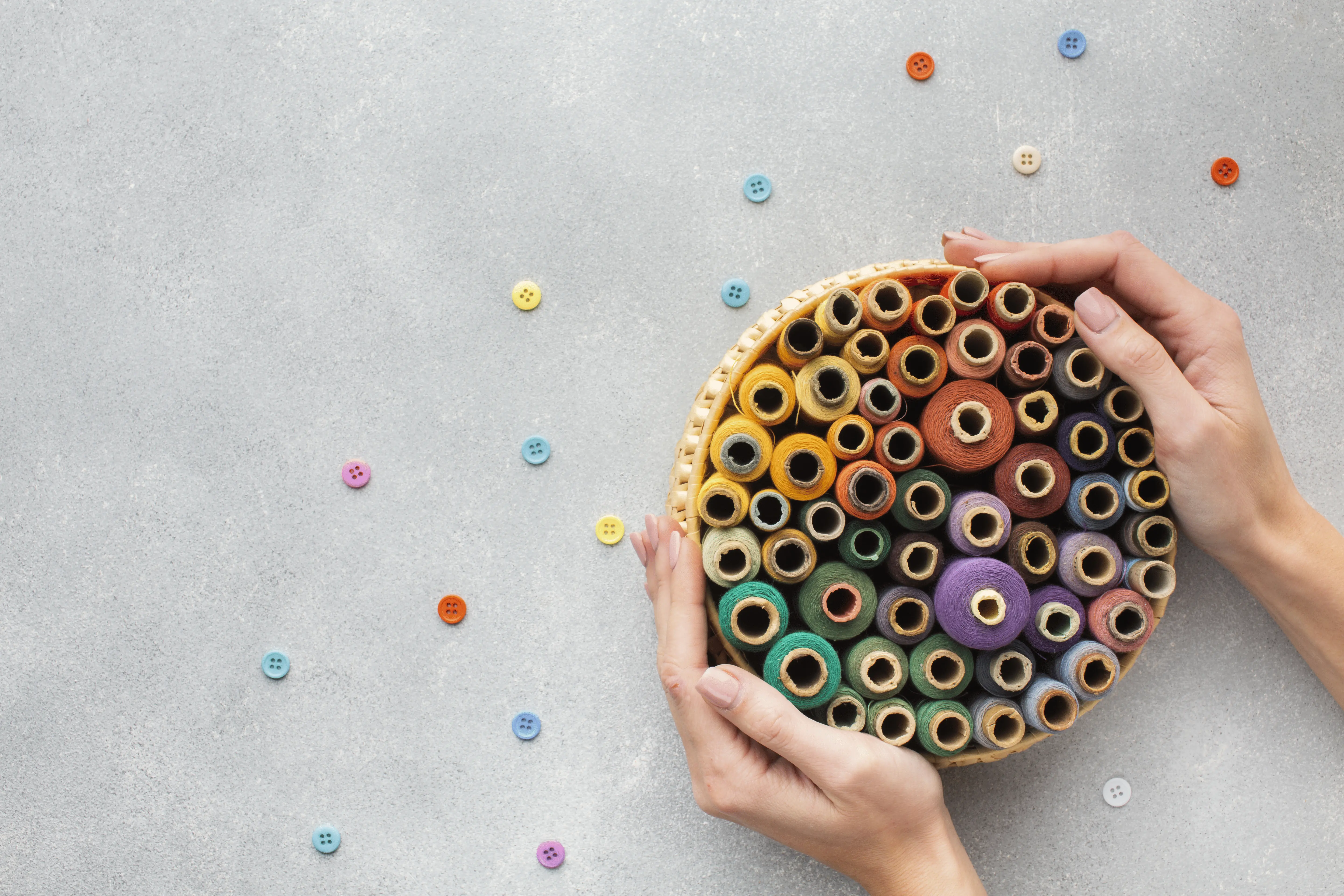
Before stitching, always lay out your threads on the fabric you're using. Seeing the shades together—under real light—helps you avoid mismatched tones and unexpected clashing.
Helpful Tools for Choosing Embroidery Palettes
You don't have to do this by eye every time. Several tools make the color planning process easier:
- Digital generators like Adobe Color Wheel let you play with schemes visually.
- Embroidery-specific apps like Stitch Palettes or Thread Picker translate digital palettes into real thread brands.
- Avenfair color cards are a simple, tactile way to compare and match thread shades before stitching—especially helpful if you prefer working offline or planning with fabric samples.
Bring It All Together: Your Next Color Story
Color theory isn't about rigid rules—it's a flexible framework. Once you know the basics, you can break them creatively. Want to stitch a snowflake pattern? Try a monochrome range of icy blues. Designing a bold geometric hoop? Reach for a triadic mix of mustard, crimson, and turquoise. Going soft and botanical? Analogous pinks and reds will carry you through.
Most importantly: your thread palette should feel right to you. If it sparks curiosity or excitement before you even thread the needle, you're on the right path.
Ready to Try?
Pick a color scheme—complementary, analogous, triadic, or monochromatic—and build your own embroidery palette from scratch. Trust your eye, test it on fabric, and stitch something that tells a story through color alone.
Want a shortcut? Browse Avenfair's curated thread bundles on Amazon to get started with beautifully coordinated shades.